Brand: Strategy, Voice, Identity, Digital-traditional Expression, Guidelines, product packaging
Project: Armed with a groundbreaking new product set to revolutionize an established market, and facing the challenges inherent in a direct-to-consumer launch approach, the Carewave corporation sought a distinctive presence in the expansive realm of solutions for back pain. Equipped with a fully functional prototype and ambitious expansion aspirations, Carewave sought assistance in refining the product's name and crafting a brand identity that effectively conveyed the advantages of pulsed heat to customers.
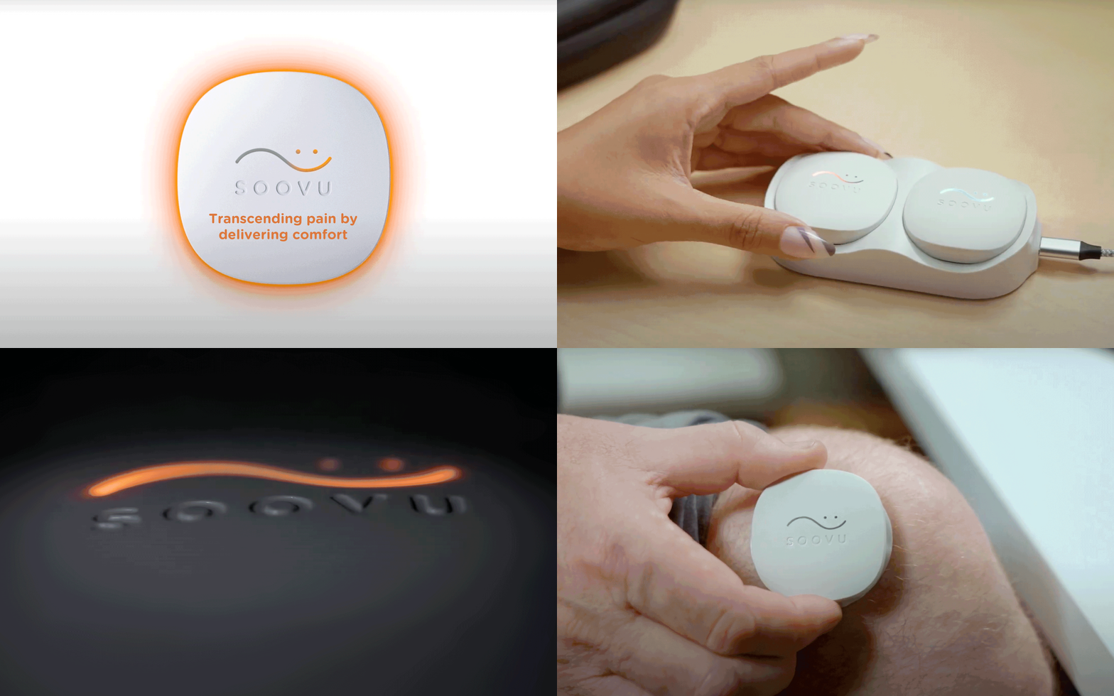
Solution: A comprehensive brand strategy was formulated, emphasizing a unique aspect often overlooked but of utmost importance: comfort. Rather than fixating on the 'what' of "pulsed heat," our foundational brand strategy for Soovu centered around the 'why,' resonating with the profound need for comfort within the target audience. The chosen name, Soovu, was carefully selected to convey the product's quick relief and soothing qualities, complemented by a friendly brand identity designed to set Soovu apart in a competitive market.
Our visual solution for the Soovu brand emerged from in-depth interviews with back pain sufferers, including those dealing with chronic pain. Despite their challenges, they remained hopeful for relief. Symbolically reflecting this hope, the brand identity incorporates the rhythmic wave of pulsed heat transforming into a comforting smile. The color palette consists of warm waves, providing a versatile canvas, while a soft and friendly font enhances the brand's name and design kit. This cohesive visual language extends seamlessly across product, packaging, digital, and communications, maintaining a signature sense of warm soothing calmness.
In terms of tone of voice, the same hopeful idea served as the foundation, guiding our messaging to echo the optimism of those seeking relief.
Result: GeekWire Awards - Finalist - UX Design of the Year


